CAMBRIDGE UNIVERSITY PRESS

Design System creation and documentation for all Cambridge.org web estates, along with the structure and design of the global navigation and homepages.
2022/23  •  1.5 year project  •   Design system creation & website migration support   •   Product Design
Final project outcome
|
View the live site
Introduction
Cambridge University Press and Cambridge Assessment recently merged to present a unified brand by developing the new Cambridge University Press and Assessment corporate website.
As part of the exciting merger, a Design System was needed to ensure uniformity across digital assets, enhancing user experience by providing a cohesive visual and functional language, as well as supporting the migration to a new CSS platform, Drupal.
As both entities already had well-established websites, a new global navigation and set of homepage designs were also needed to showcase all the various web estates in a clear and easy to understand manner.
Team and Responsibilities
The project was ongoing when I started at Make it Clear, after several months of supporting the Creative Director and onboarding into the project, I the took over and oversaw the project with the support of a UX designer. My role included:
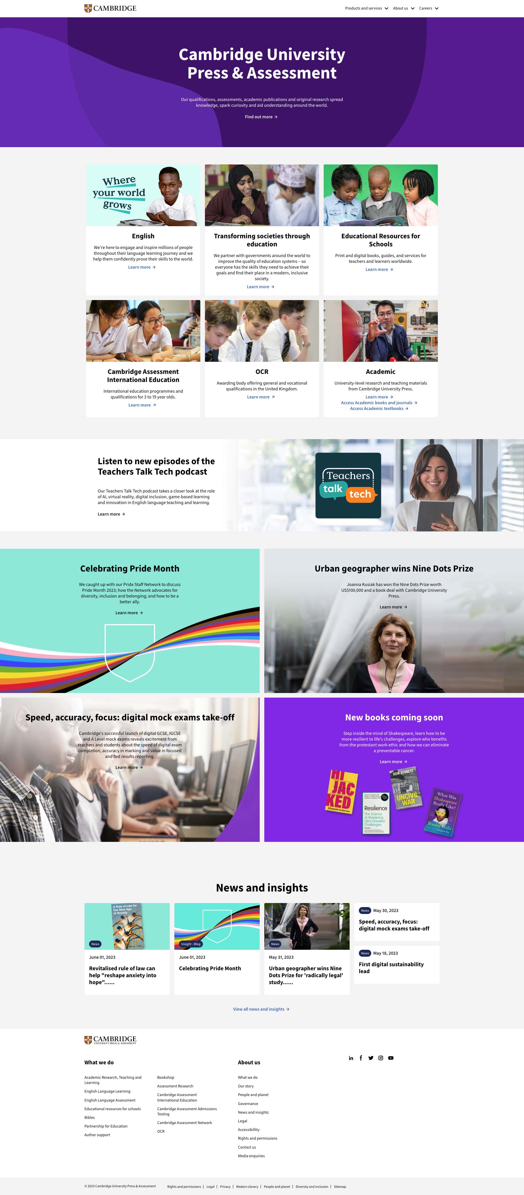
Cambridge University Press Atomic Design System
By creating a atomic Design System including reusable components and detailed documentation, we provided a scalable framework for building consistent, modular and efficient interfaces across Cambridge's various digital platforms.
Components were built using the most up to date Figma updates including variables, booleans, nesting properties etc.
The Design System would also facilitate scalability by providing a structured framework for expansion, enabling seamless integration of new features and content during website migrations.
The following components were created, with the library structure following atomic design principles:
ATOMS:
  • Text styles
  • Colour variables
  • Icons
  • Buttons
  • Input fields
  • Checkboxes
  • Radio buttons
  • Switches
  • Labels
  • Badges
  • Avatars
MOLECULES:
  • Form groups
  • Button groups
  • Dropdown menus
  • Navigation bars
  • Tooltips
  • Cards
  • Media objects
  • Modals
  • Tabs
  • Pagination
  • Slider
ORGANISMS
  • Header
  • Footer
  • Sidebar
  • Contact form
  • Login form
  • Hero section
  • Modals
Example Page - Radio buttons
Figma file with all pages can be shown on request
Global Navigation and Homepage Design Requirements
With the merging of two legacy Cambridge website, along with four sub brand areas, a new global navigation was needed to ensure the website was easy to understand and navigate. The following tasks were to be undertaken:
Global navigation principles
The objectives of performing a deep dive into global navigation best practices are to create a set of overarching principles that will underpin and support the approach and future design work.
Universal Principles
  • Mega menus should be opened by trigger via a mouse click and not a hover. Hover does not imply intent, it is easy for users to accidentally 'trigger' an 'on hover menu'.
  • Where an arrow is used, clicking that link should trigger the opening of a mega or drop down menu.
  • The Cambridge logo should always appear in its full form.
Product Group Navigation
  • Sticky header functionality will be explored, allowing users to access the main navigation options at all time.
  • Mega menus help to structure and illustrate choices. They will include the ability to add product specific descriptions and graphical CTAs.
  • It is recommended breadcrumbs will sit at the top of the page beneath the navigation for full visibility and ease of use.
Mobile Navigation Principles
  • Best practice is for all selectable items to be in 48px boundary box and activated on touch.
  • All information should be replicated across all viewports as the user will expect to see functionality in the same location for mobile, tablet and desktop.
  • Hamburger menus accommodate a large number of options, but these options are less discoverable.
Component Build and Documentation
Global Navigation Preview
Homepage Design
Business Impact/Results
"It was extremely important for our new website to be based on user research; our audience is niche and their needs are specific. Working with Make It Clear meant that our audience was at the heart of the project at all times – from identifying their goals and challenges, to solving them through user stories and journey mapping. The wireframes and UI designs were crucial in making sure the handover between design and development was as seamless as possible. It was a pleasure working with the team at Make It Clear."
Aisling Miller, Senior Digital Marketing Manager, Cambridge University Press