Scope in Short
Supporting a scalable, Multi-Brand Design System across web and mobile.
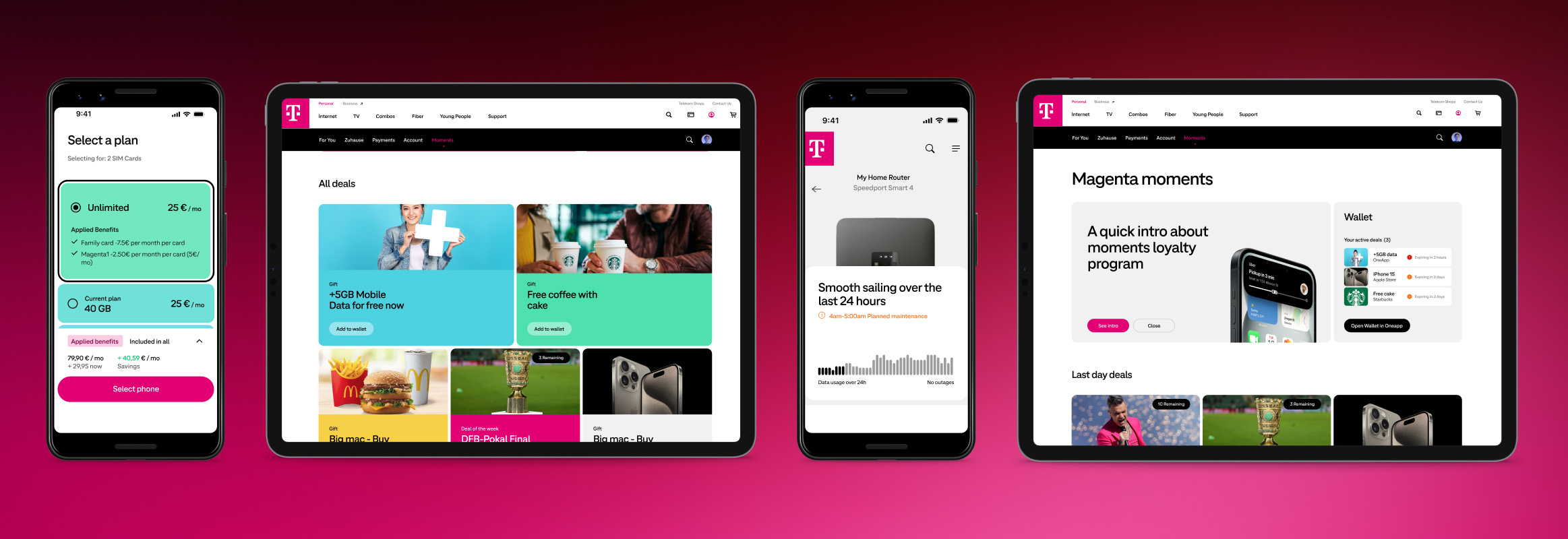
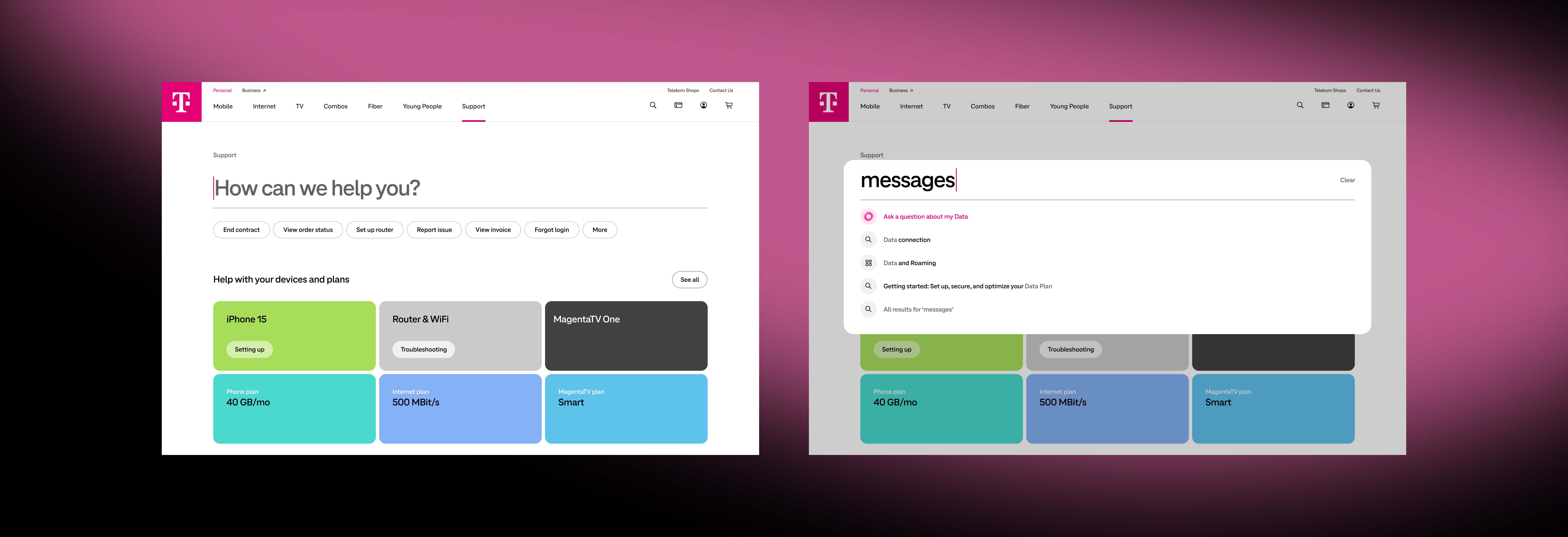
Deutsche Telekom, a leading global telecommunications company, needed a sophisticated Design System to support the design of numerous digital products across teams and brands. It must reflect the unique Telekom brand, enhance collaboration between design and development teams, improve consistency, reduce costs, while speeding up time-to-market.
The team consisted of four designers, I was the senior designer supporting the design lead. We had weekly check-ins with the Deutsche Telekom head of design to present work and implement feedback. I helped design and implement the following deliverables:
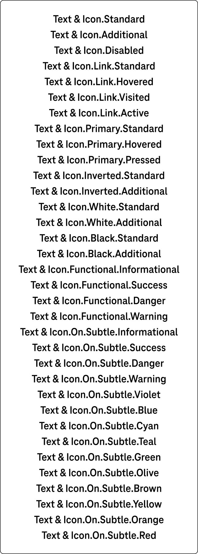
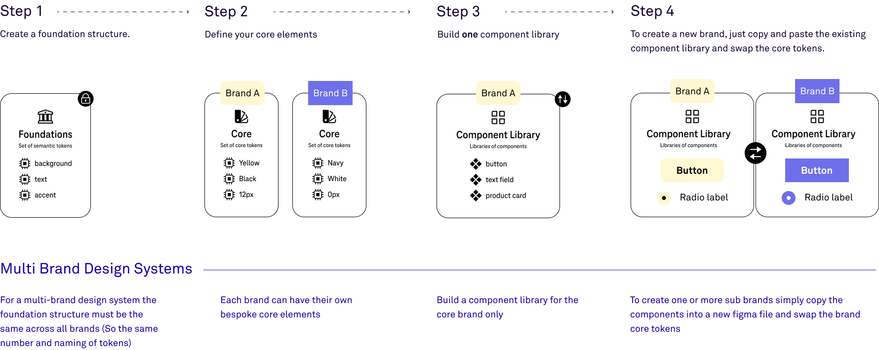
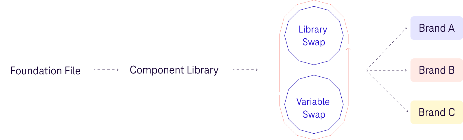
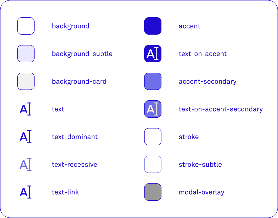
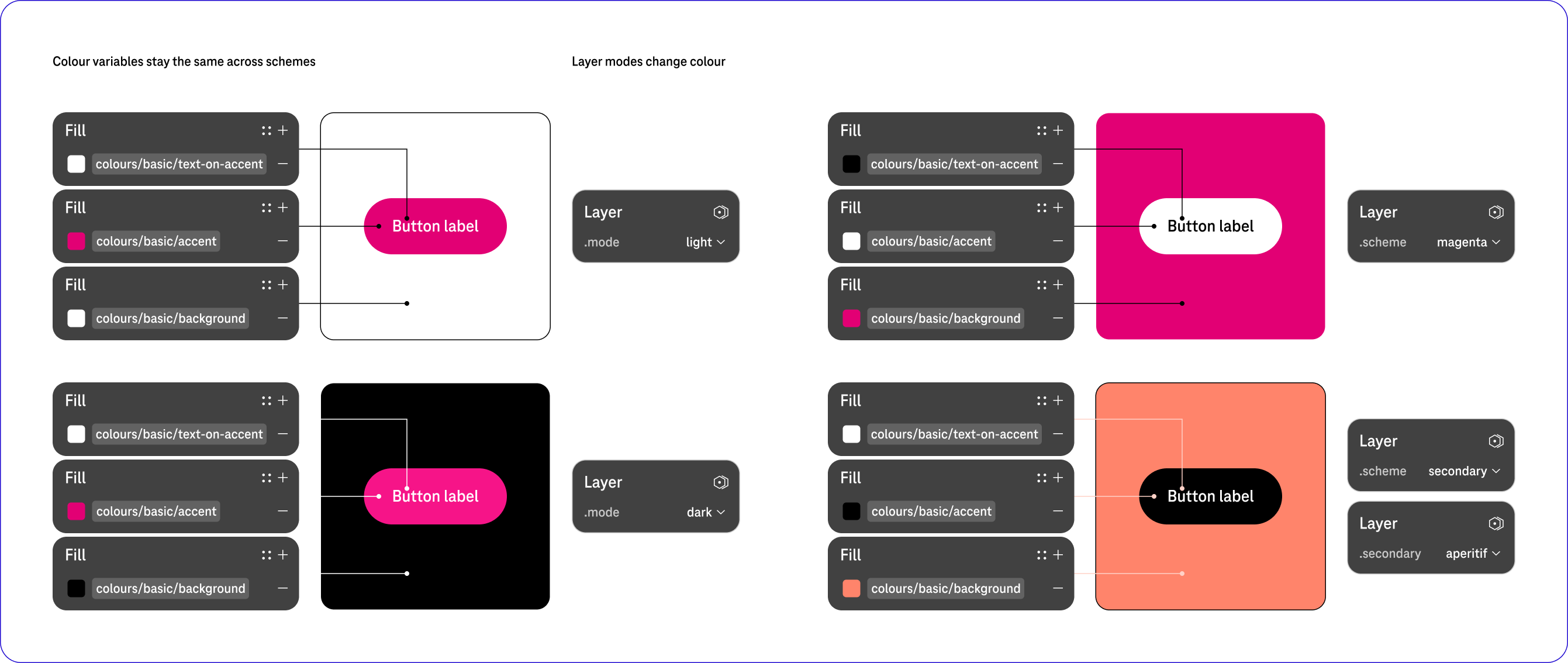
- Multi-Brand Design System foundations.
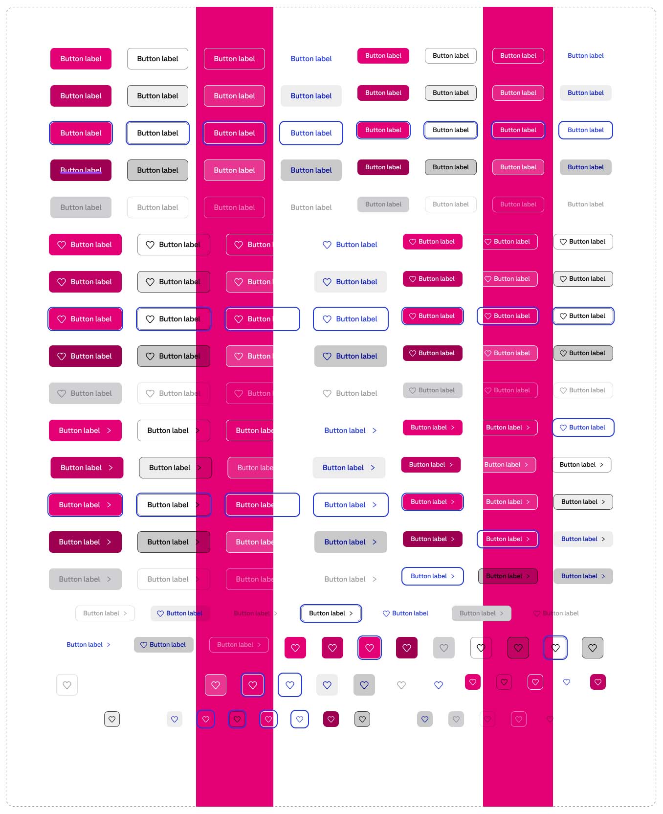
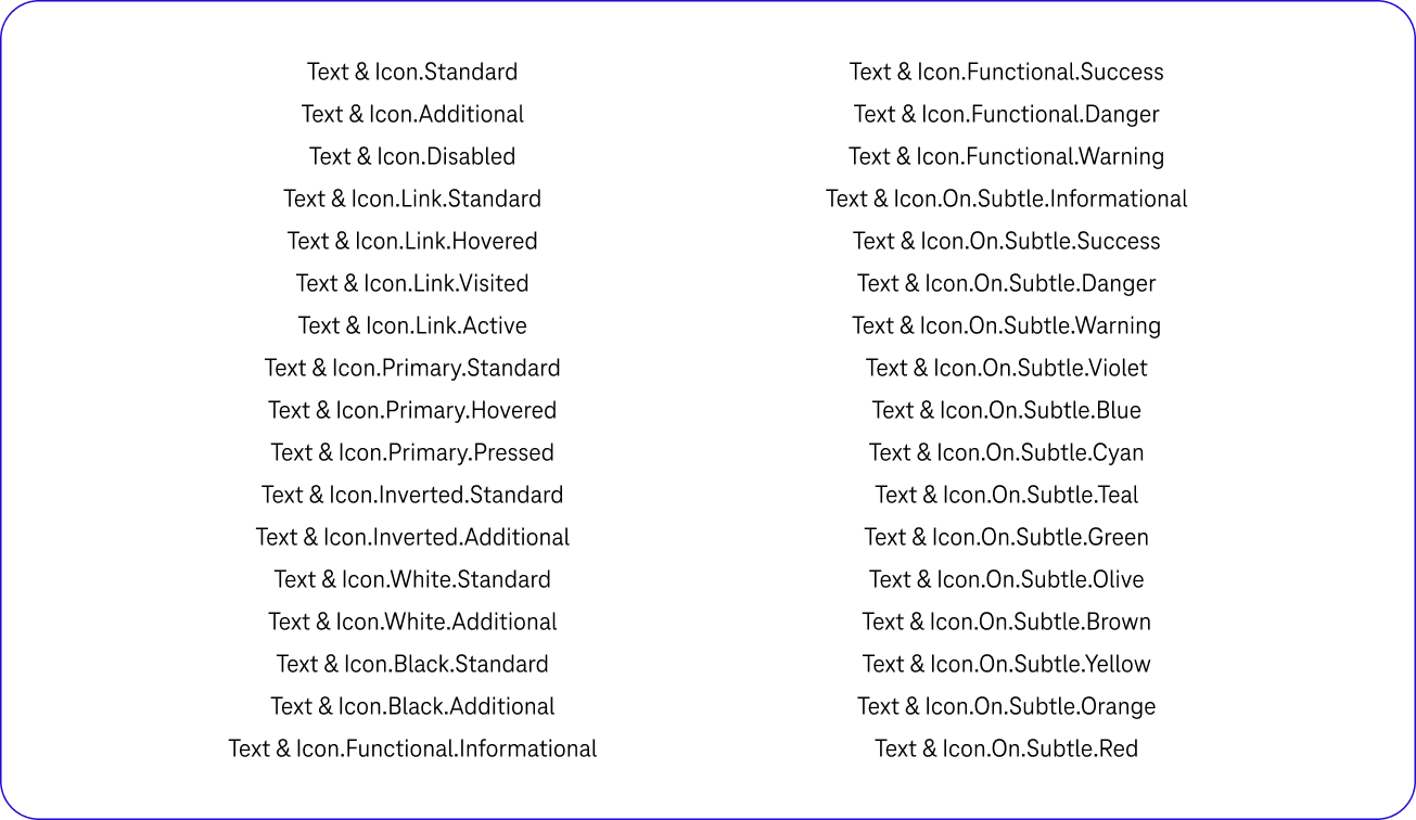
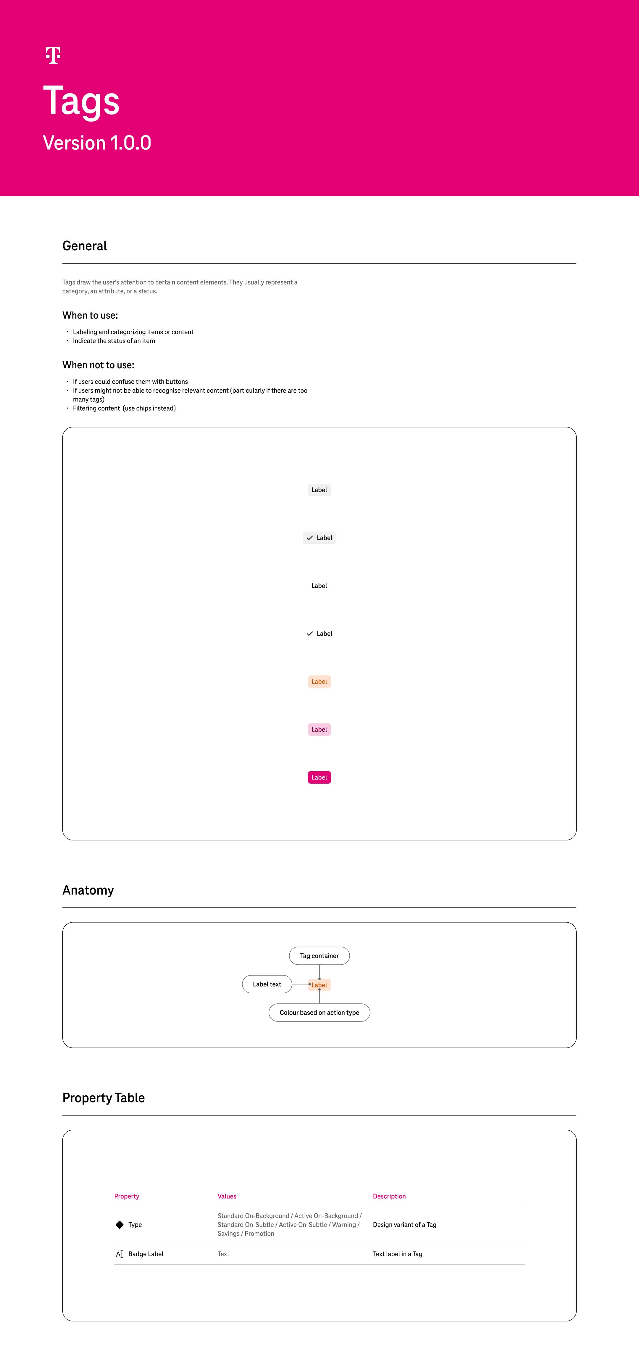
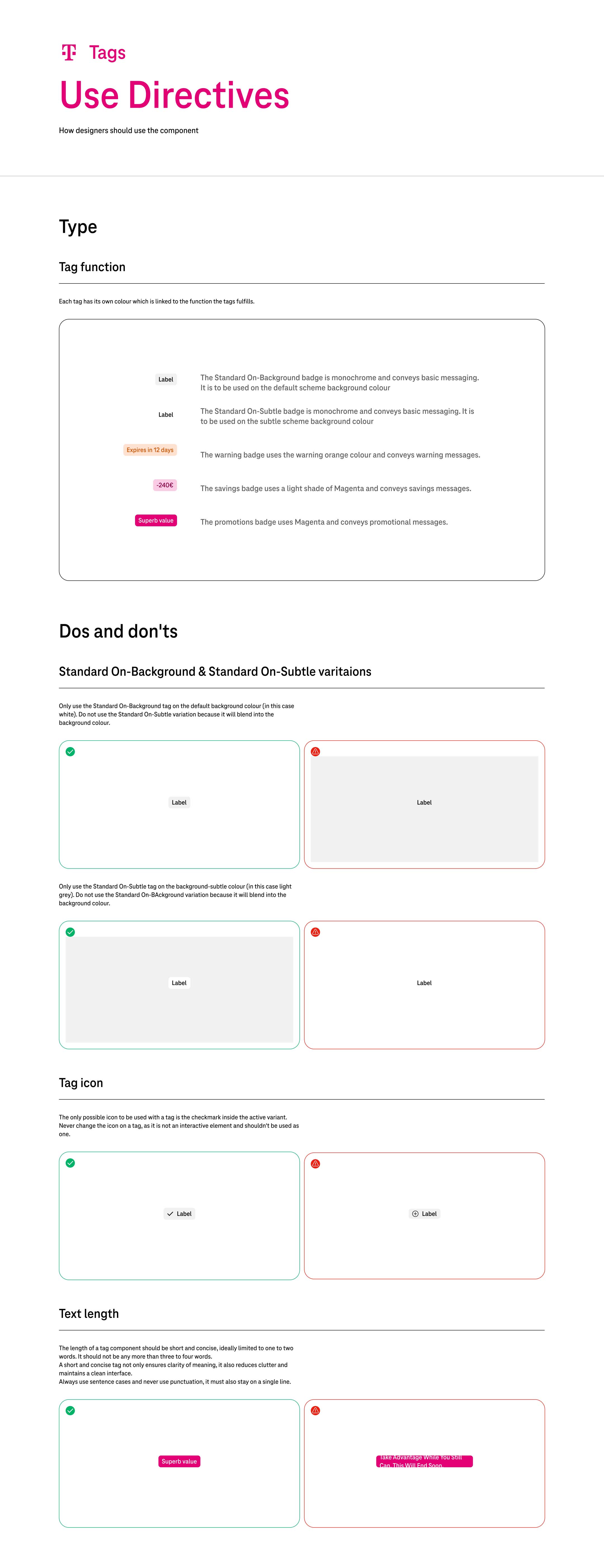
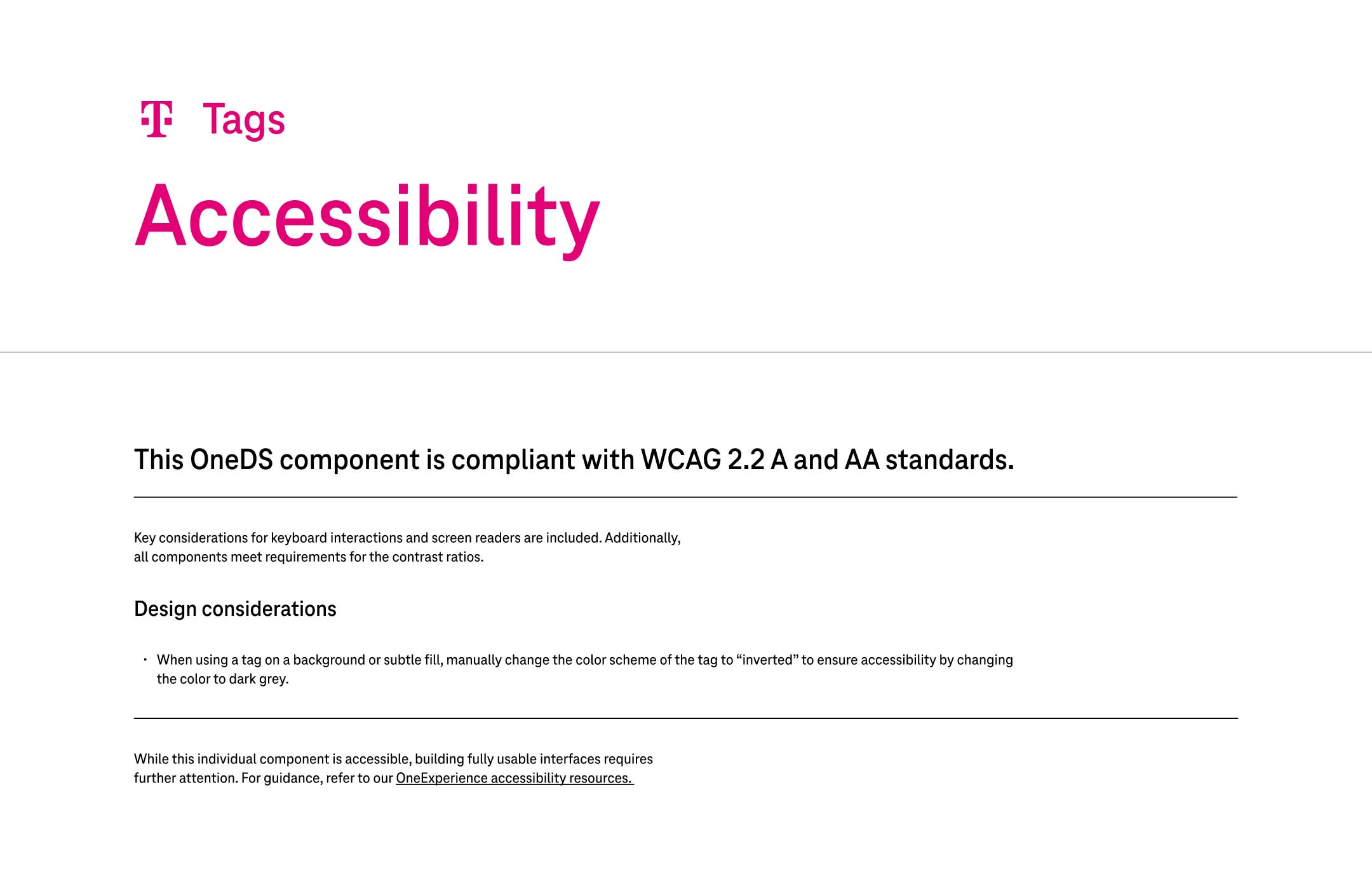
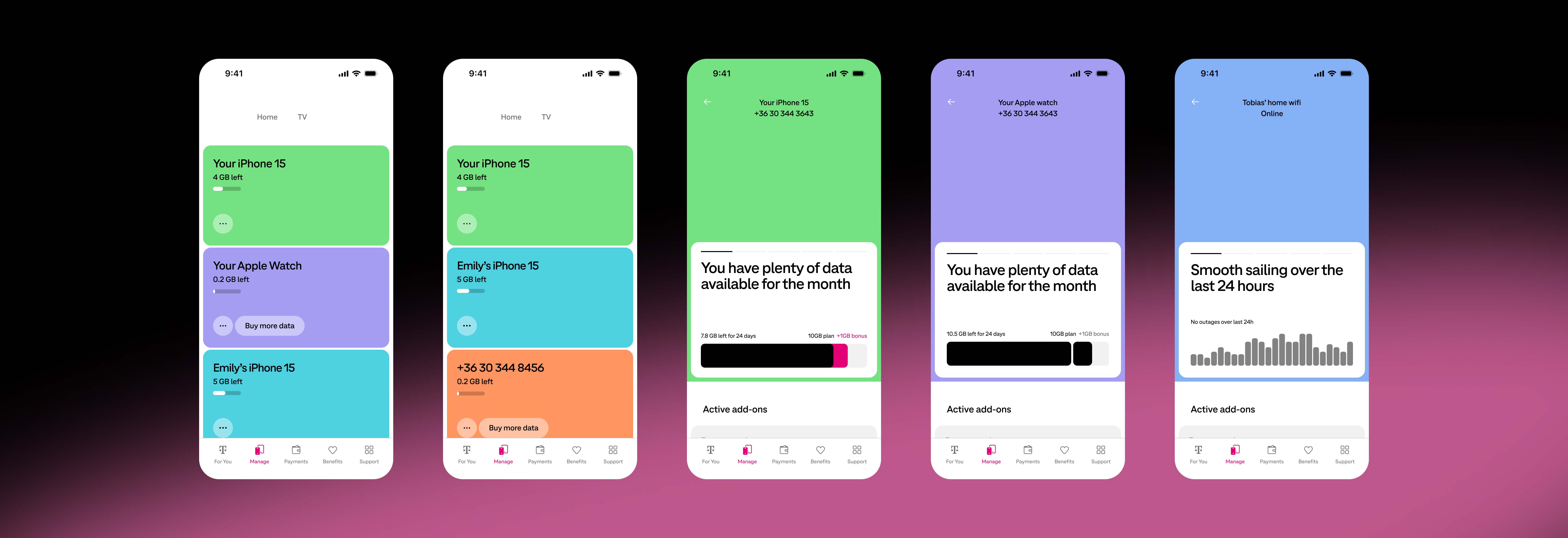
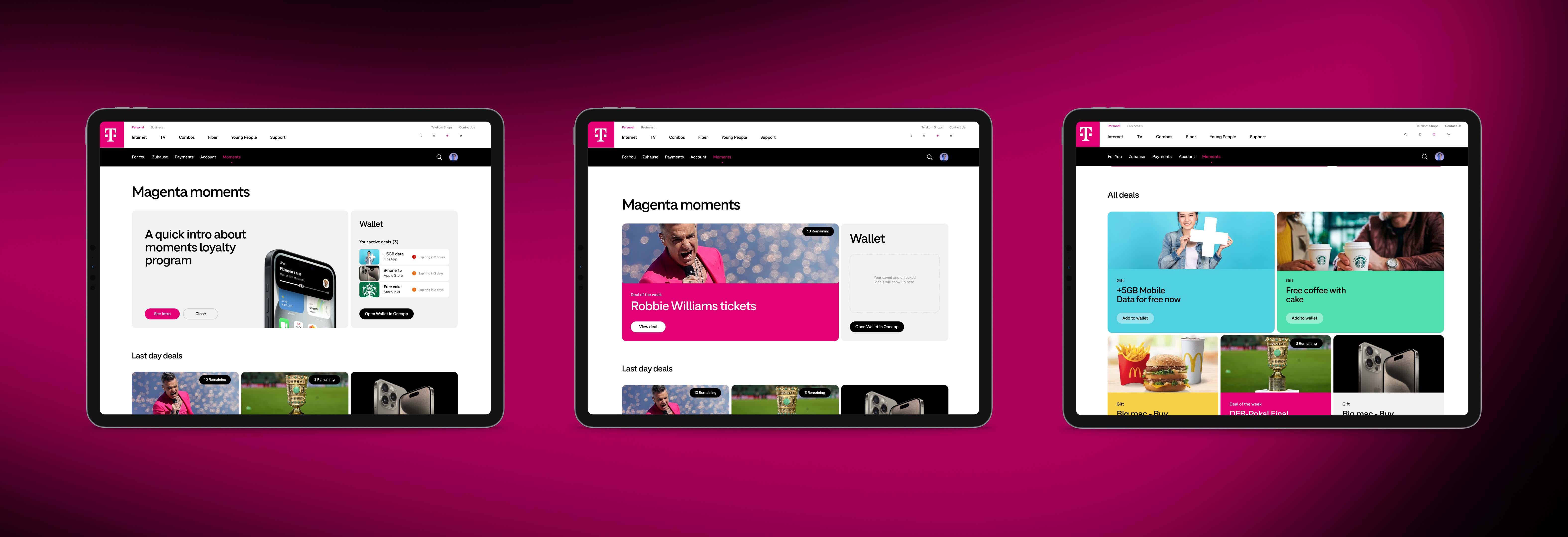
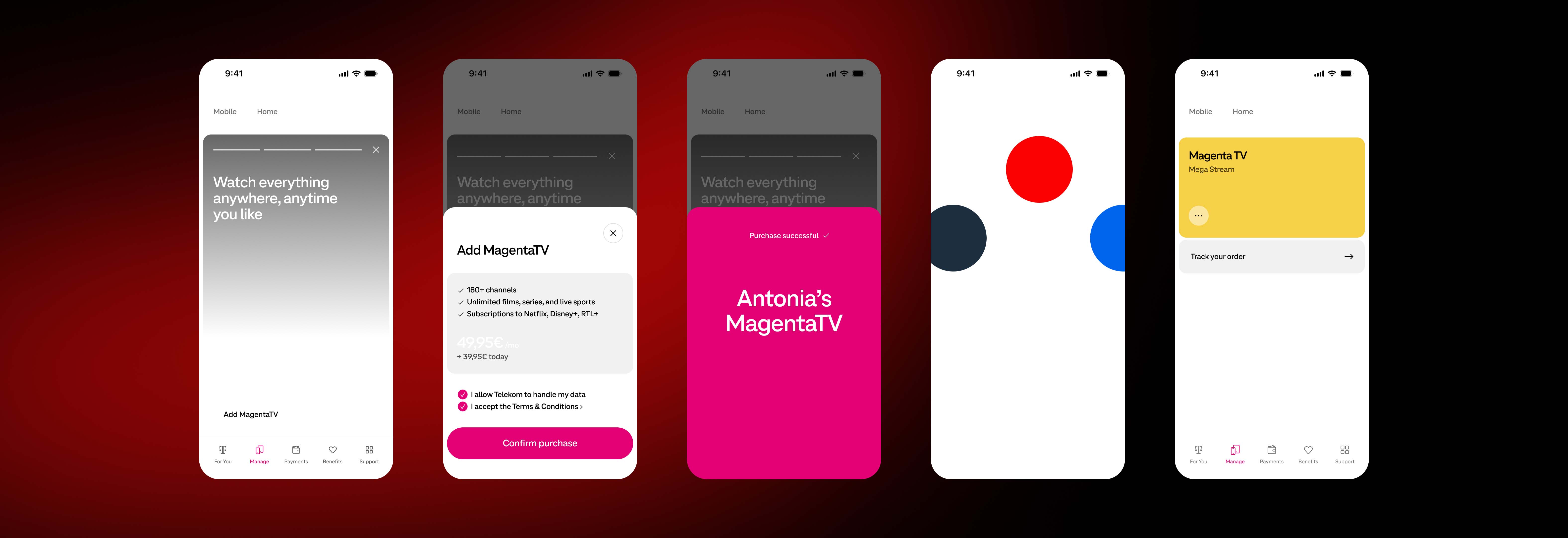
- Creation of fifty complex components to support the MVP transition from old to new Deutsch Telekom brand.
- Four separate Figma libraries to support two unique Telekom brands across web and mobile.
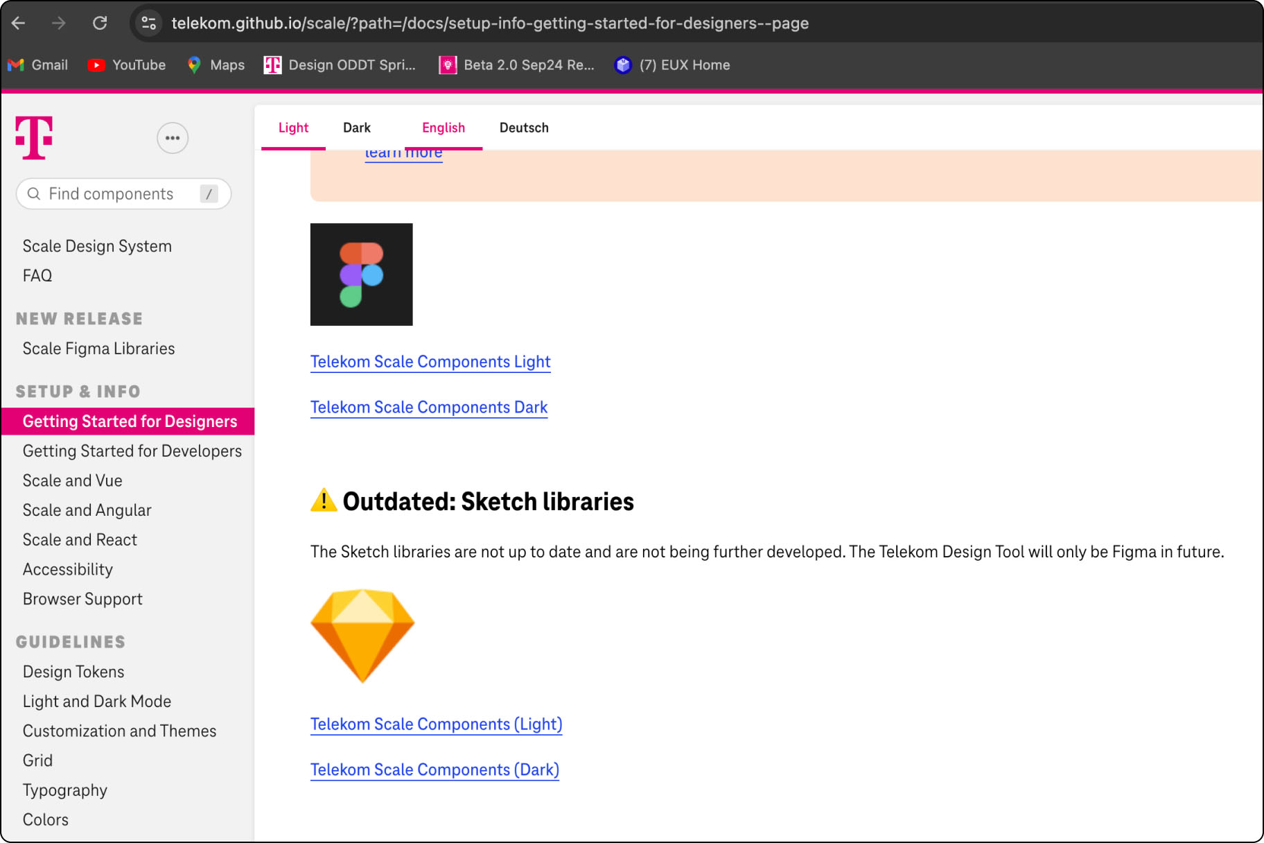
- Detailed documentation to support onboarding, as well as the rollout and usage of components.
- A new governance model, collaboration and request flows.


