MAKE IT CLEAR

A creative rebranding and implementation for the digital design agency Make it Clear, including Website Design and Design System creation.
2023  •  6 month project  •   Promotional (Public) Website & Design System creation   •   Product Design   •   Brand & Strategy
Final project outcome
|
View the live site
Overview & Role
The brief was to elevate the Make it Clear online presence and revitalise all digital assets through a comprehensive rebranding and website redesign.
I oversaw the project from conception through to completion leading the user experience team, from the initial research phase through to the design and development of the site. I supported and consulted on the re-brand which was led by the creative director.
Project key deliverables
  • Competitive and comparative research
  • Existing website review
  • Re-brand
  • Work shopping with internal team for idea generation
  • Information architecture mapping
  • Mid fidelity wireframing
  • High fidelity wireframing
  • UI Creative concepts
  • Design System foundations
  • Development handover and feedback loop
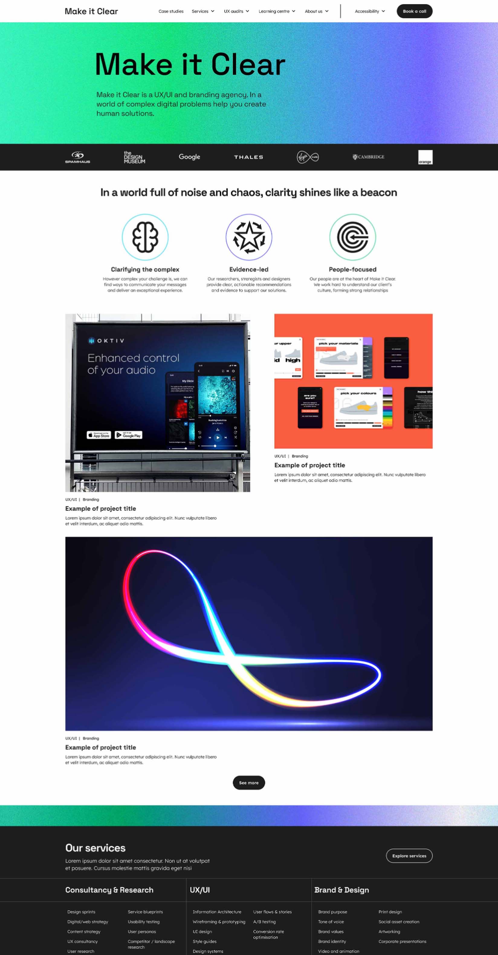
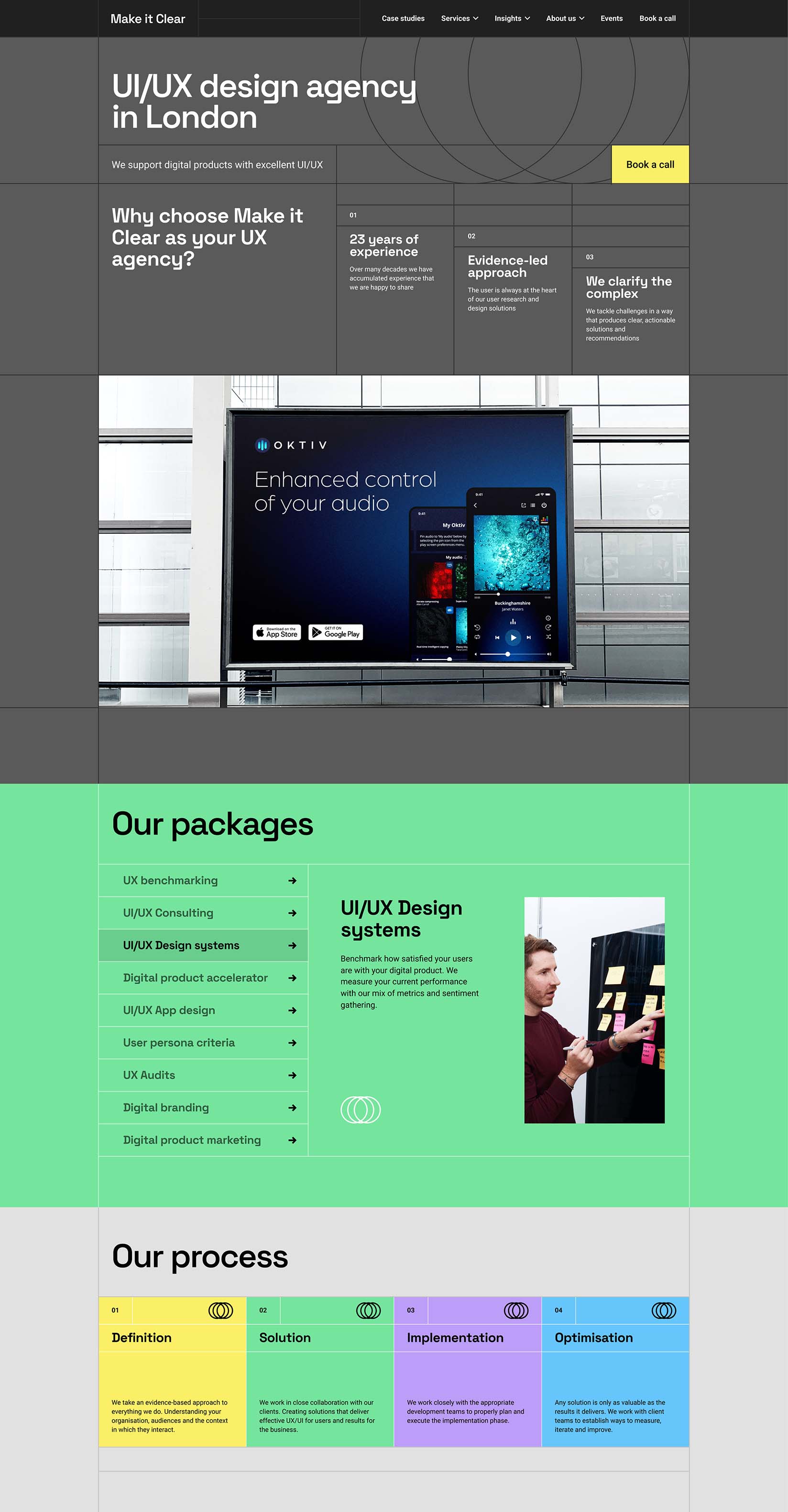
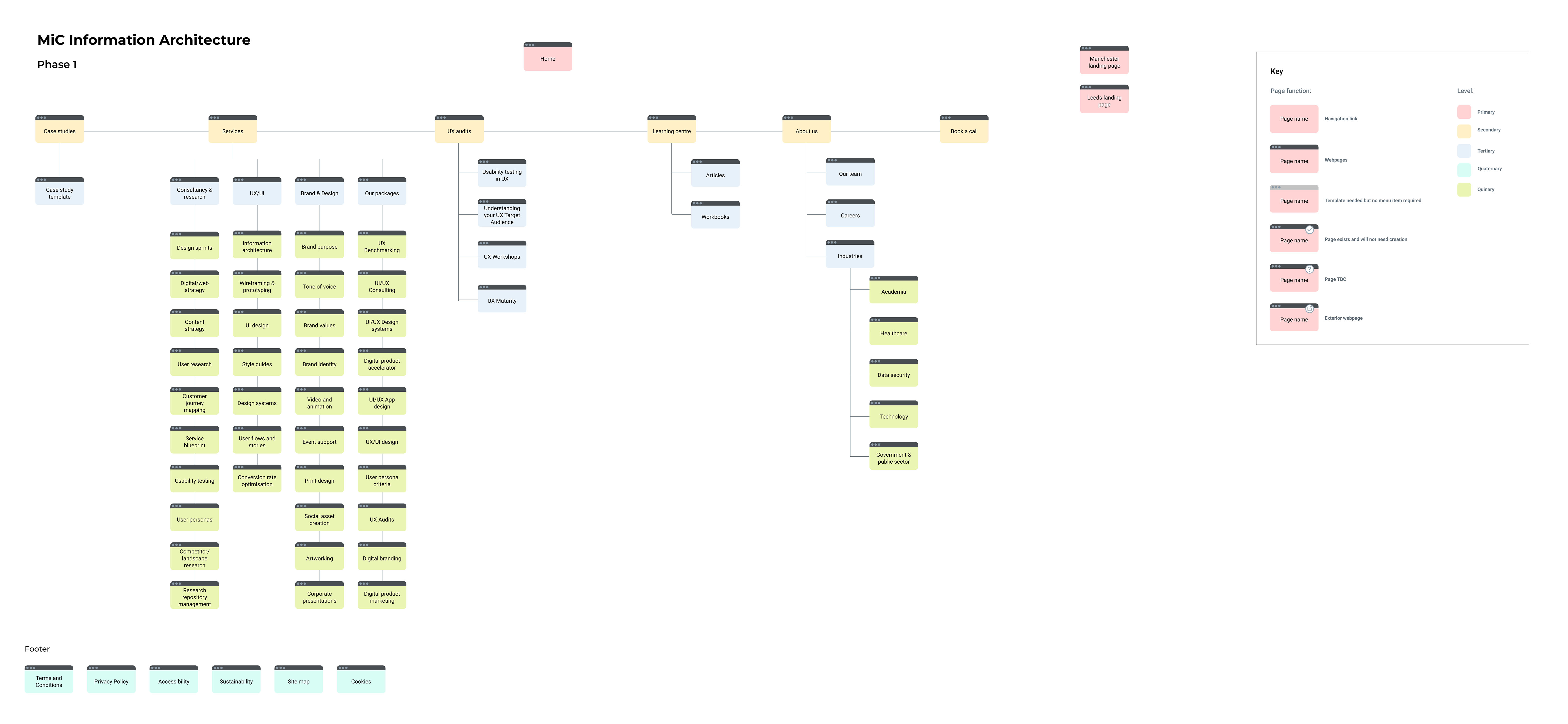
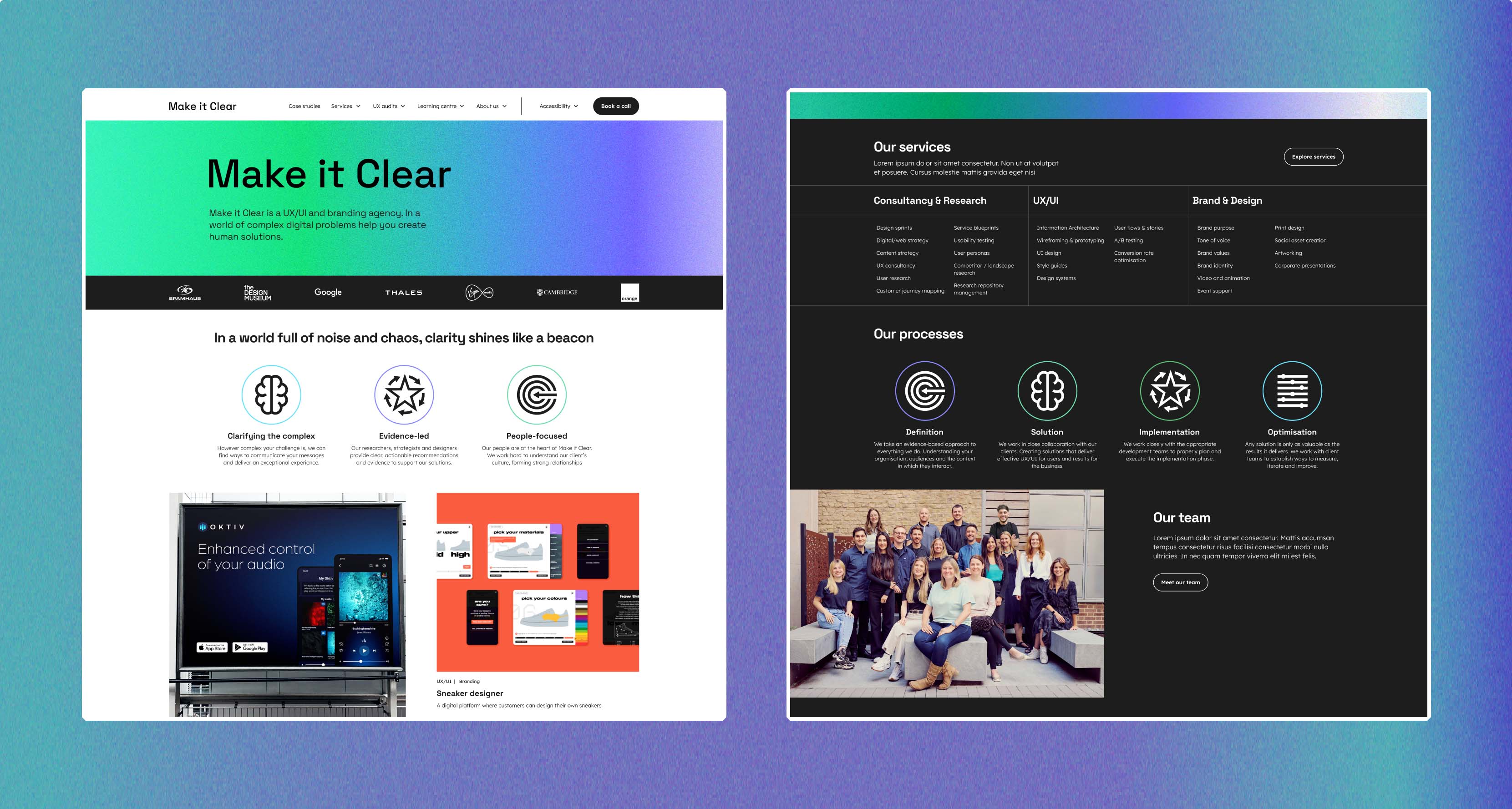
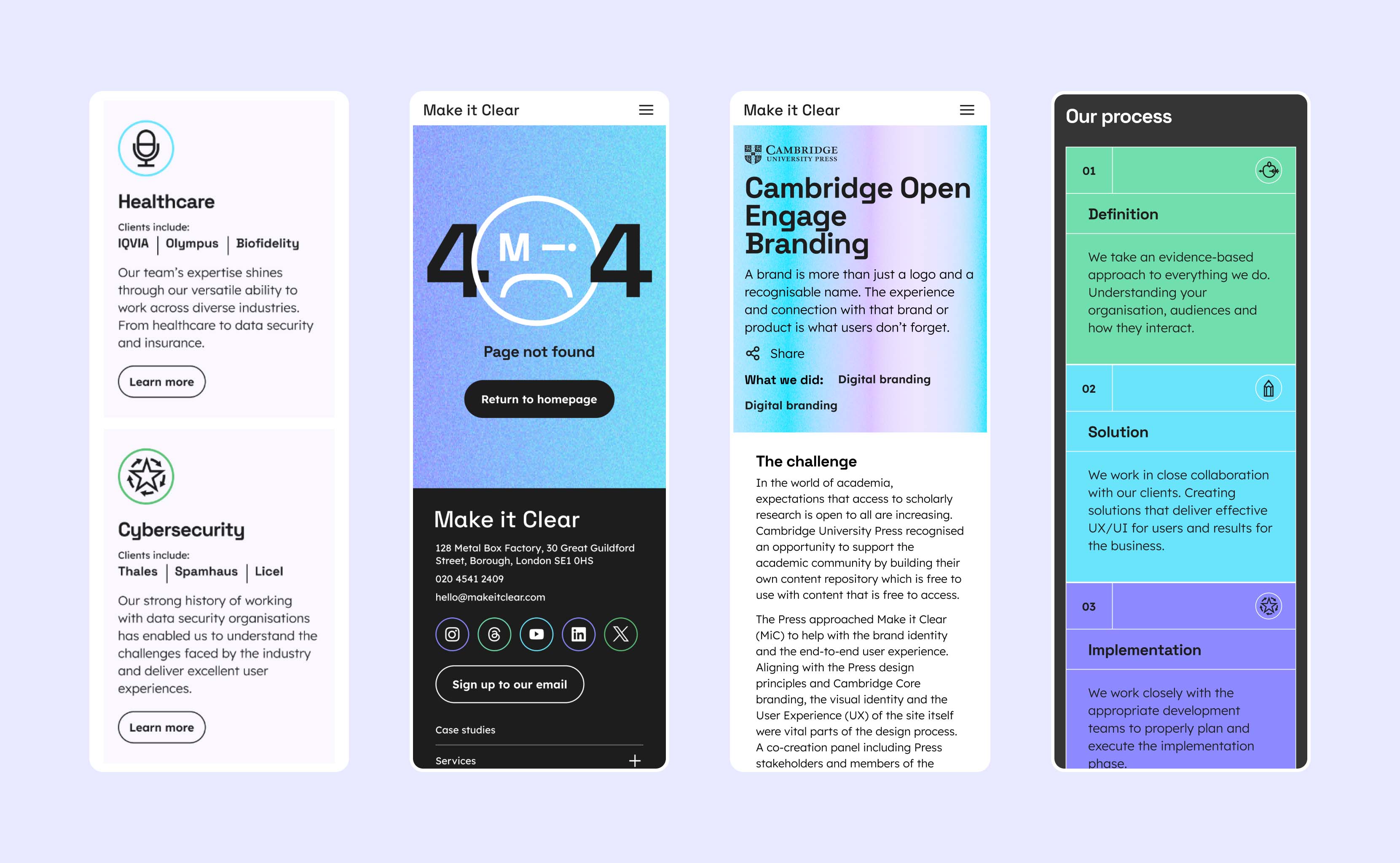
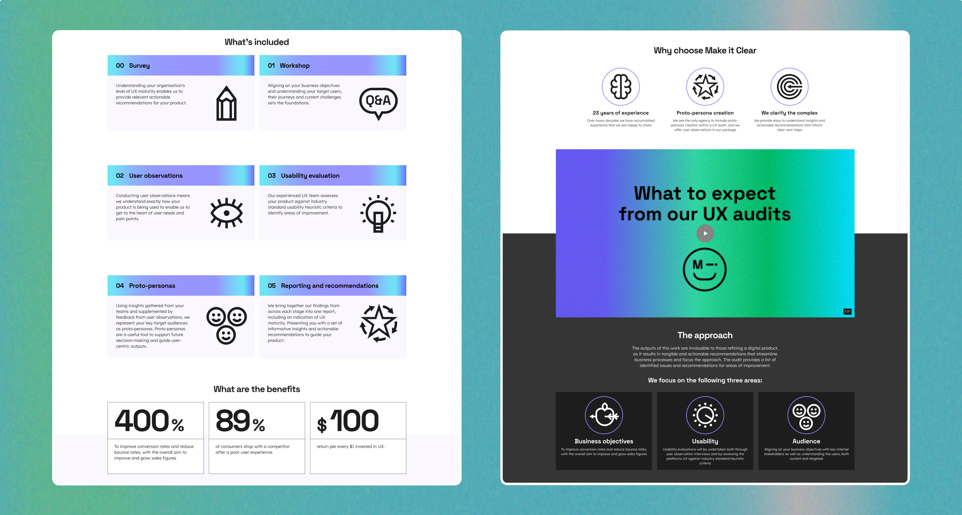
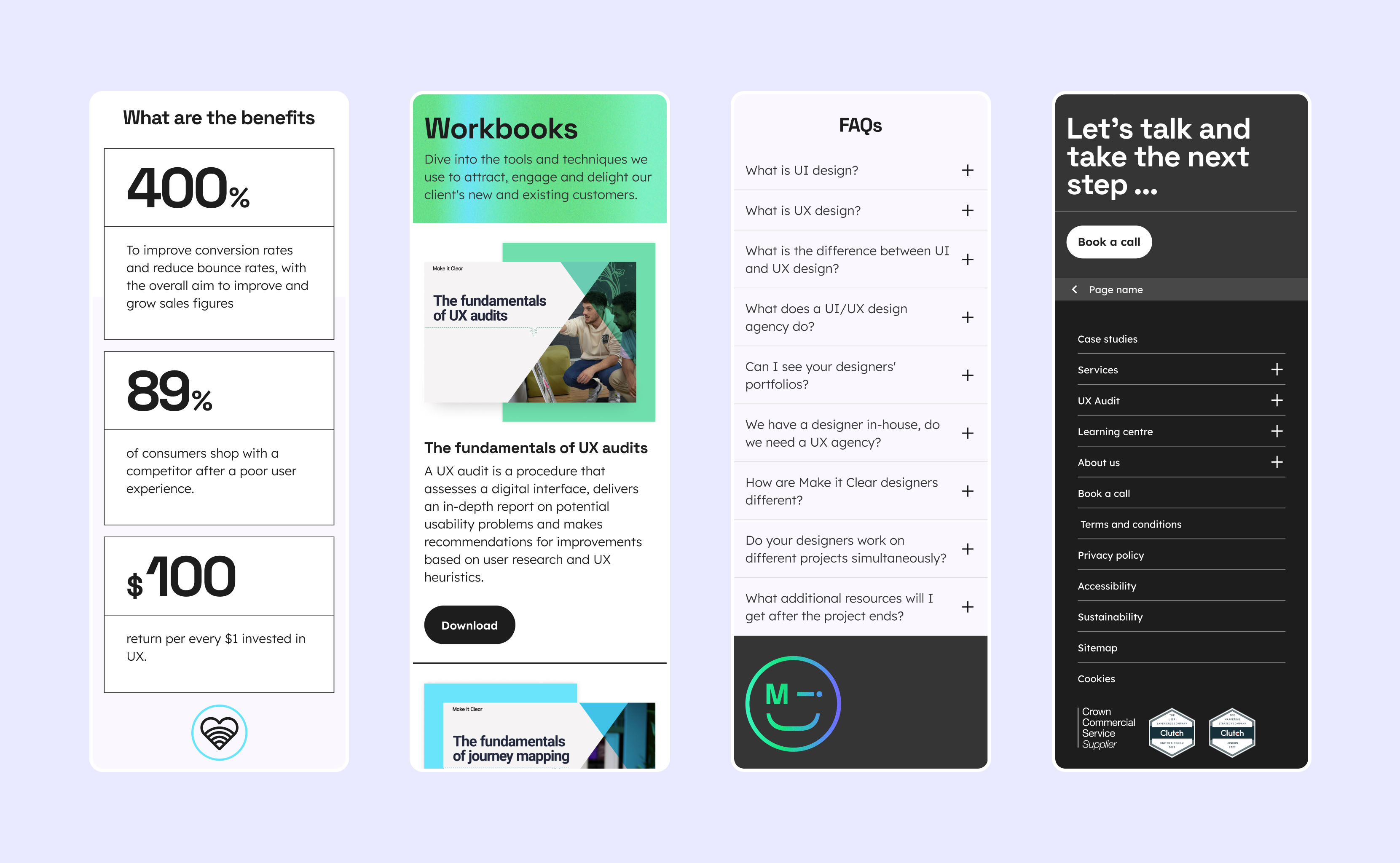
Competitive and Comparative Research
To ensure our new visual identity and website content would allow us to have our own unique voice and stand out from an already competitive market, we conducted thorough research into industry trends, competitor strategies research and user expectations. We also worked closely with a marketing agency to help improve our SEO.
A selection of visual research.
Key Findings:
  • Focus on certain sections of the market that reflected our skillset and past experience, these were health tech, education tech and cyber security.
  • Include greater content in the three key areas mentioned above areas to improve our SEO and show we are thought/design leaders in those areas.
  • Include and showcase our key methodologies and ways of working.
  • The creation of a learning centre to showcase our user experience expertise.
  • Distil our key services in a clear and easy to understand way for prospective clients.
  • UX audits as a key offering because it is a good source of lead generation and has the potential to grow into larger projects.
  • The website to greater reflect our personality, both as individuals and as a group.
Existing Website Review
The initial phase involved a thorough analysis of the current website. Assessing its strengths, weaknesses and identified areas for improvement. The marketing agency we partnered with performed an overarching website analysis, reviewing key indicators such as page visits, bounce rates, etc. From this analysis we were able to help gauge which pages we needed to keep in their current state along with which pages needed amending or removing.
Several pages of the existing website.
Two key areas for improvement:
Website trafffic and conversion growth
  • Improve SEO by creating more impactful on-brand marketing content and improving keyword research
  • Improve website loading time
  • Clear CTA’s, points of sale and contact information
  • Emphasise current and existing clients such as Orange, Google and Cambridge University Press
  • Optimise for mobile
  • Create a stronger brand identity that reflects the personality of the team
Stronger visual identity
  • Outdated illustrative style
  • Inconsistent layouts and poor use of white space
  • Typography lacking personality
  • Not enough colour, uninspiring monochrome palette
  • Certain aspects of the UI felt tired such as the cards and hero banners
  • Brand imagery to be used in a more imaginative way
  • No Design System in place
Re-Brand
A core part of the project was to perform a company rebrand from both a visual and strategic perspective. To align the vision of the senior leadership team, we conducted several internal collaborative workshops, through these interactive sessions we decided upon the following visual identity and defined our target audience.
Core identity
‘Bold’, ‘Confident’ and ‘Simple’, were the design team’s mantra during the project, this also mirrors our core UX principles.
Colour
The palette below reflected the fun and eclectic personality of the team and combined to create a dynamic linear blend.
Typography
The new typography style feels modern and has more personality while also being as accessible as possible.
X3 Creative Concepts
Click images to enlarge
Information Architecture
A new IA for the site was developed. Restructuring the site navigation allowed us to increase conversions by placing key sales tools (UX audit offering) prominent CTA's (Book a call) and our services in the primary navigation.
Final UI
View below several key screens plus the website live, several key development points to consider include:
  • Home page to include our key services, principles and team ethos
  • History page championing Make it Clear’s rich and varied experience of working with some of the world’s biggest brands
  • The introduction of a learning centre, a hub of tools and resources for designers to reference and learn from
  • Introduction of a search functionality within the site, a dynamic page where users can filter by content, type and services
View the live website