ZURICH

Zurich Insurance CX — The Mobile Vision, bridging the gap between Awareness and Purchase through a modular, research-led mobile framework.
2024/25  •  5 month project  •   User Journey Mapping   •   Mobile Design   •   Future Vision
Final project outcome.
The Challenge
As the Lead Product Designer, I was tasked with defining the "Mobile Vision" for Zurich’s Motor Insurance CX initiative. Previous research revealed that while the existing site was technically responsive, it lacked service-led value. Users were dropping off because the journey felt like a rigid transaction rather than an intuitive exploration.
The Problem
High cognitive load during the Awareness & Consideration phase. Dense, text-heavy policy documentation and a lack of visual engagement created a "friction-first" experience, leading to significant user drop-off before the quote & purchase stage of the journey.
Imagery below shows the current user experience.
The visually uninspiring design buries products under poor architecture, mixed content, and PDFs. Switching browsers adds friction, preventing users from effectively finding and comparing products.
The Objective
To transform both the Awareness & Consideration and Quote & Buy stages from a static information dump into an interactive, value-first discovery engine that builds user confidence through rich content, engaging UI design, and an easy-to-navigate flow. This phase offers the greatest potential for impact, as it is the most critical part of the digital journey."
Strategic Discovery: Deconstructing the Acquisition Funnel
I mapped the end-to-end 'As-Is' journey to pinpoint exactly where the transition from research to purchase was failing. This helped uncover customer blockers, drop-off points, and key areas for improvement.
As mentioned, I focused on the Awareness & Consideration and Quote & Buy stages of the journey. This is where the highest cognitive friction exists and where users require the most reassurance before committing to a data-heavy transaction.
Key Takeaways:
Problem: The "Value Gap" Users were forced to provide personal data before receiving any perceived benefit, creating a high-friction "data-for-nothing" trade-off.
Design Solution: Quick Configurators Introduced tools and features that offer instant, estimated value upfront.
Problem: Cognitive Overload Existing policy documentation was presented as static, text-heavy PDFs or long-form tables, making it impossible to digest on mobile.
Design Solution: The Flex Card System Develop a modular card component to break complex tiers into interactive, "bitesize" units optimised for small screens.
The Problem: Friction in the Discovery Phase. High-intent users struggled to compare pricing and features because critical information was hidden within dense PDFs and legal fine print
Design Solution: Interactive Comparison Tables Use a comparison framework that allows users to toggle features and see real-time price impacts.
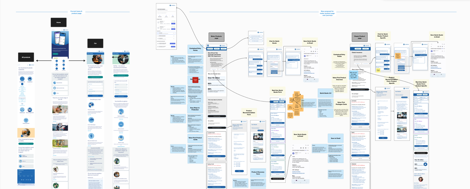
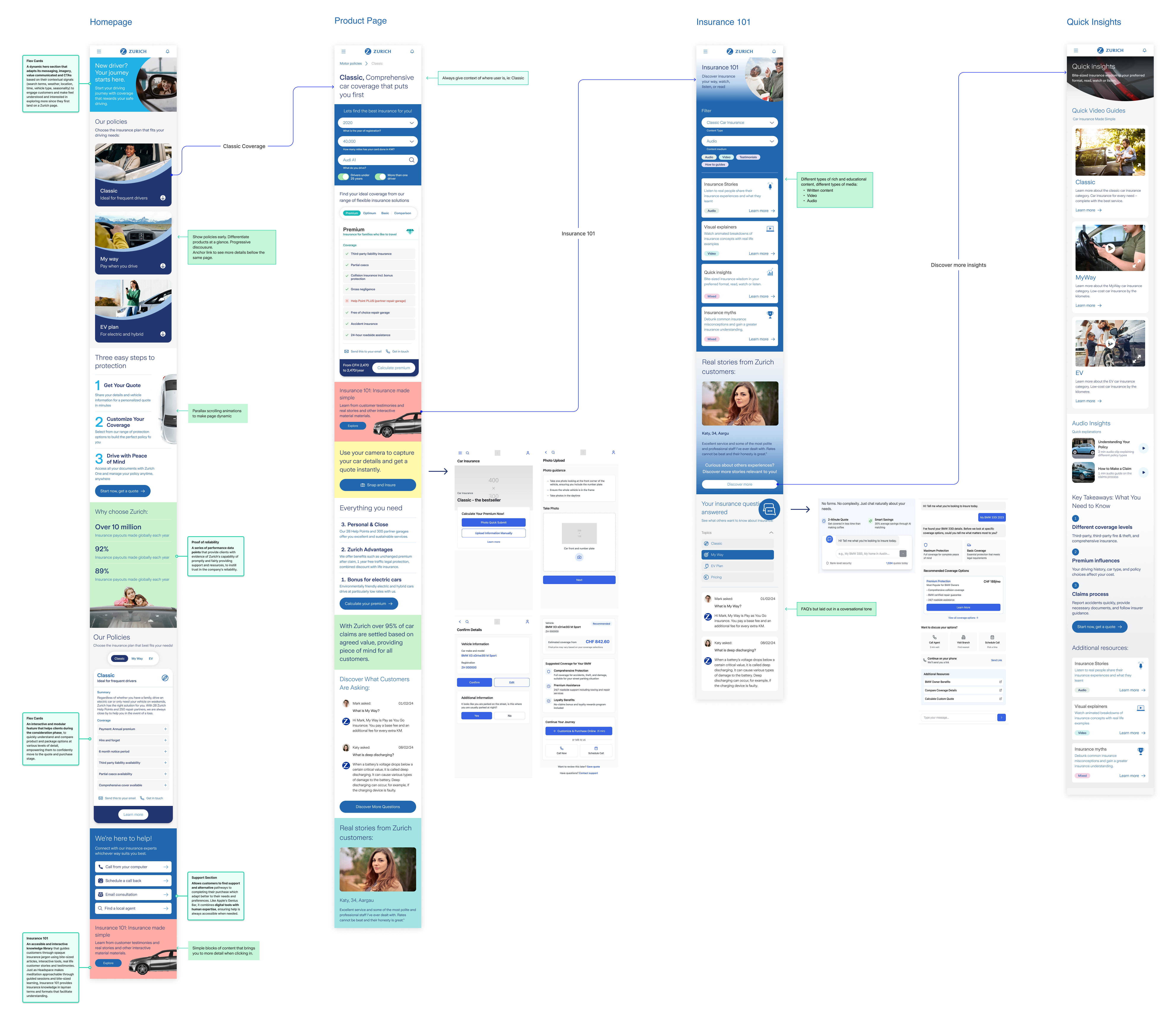
1st Design Workstream: Vehicle and Insurance Product Pages
Primary Challenge
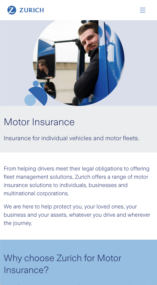
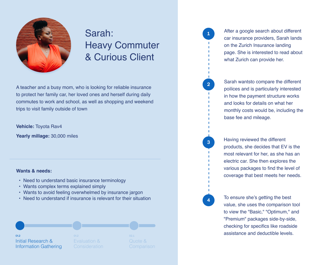
High drop-off rates on product pages such as Classic Car and EV Insurances pages, as well as the insurance type pages (Optimum, premium etc) indicate a conversion bottleneck, suggesting a disconnect between visitor expectations and the current user experience.
The Focus
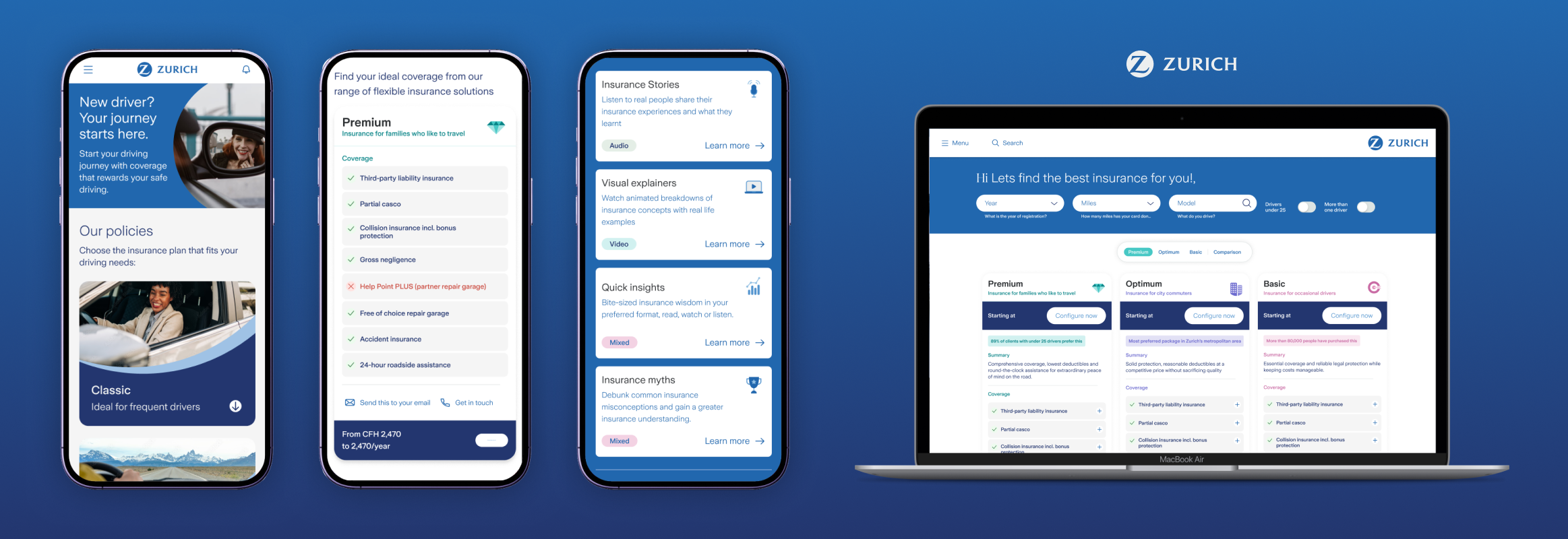
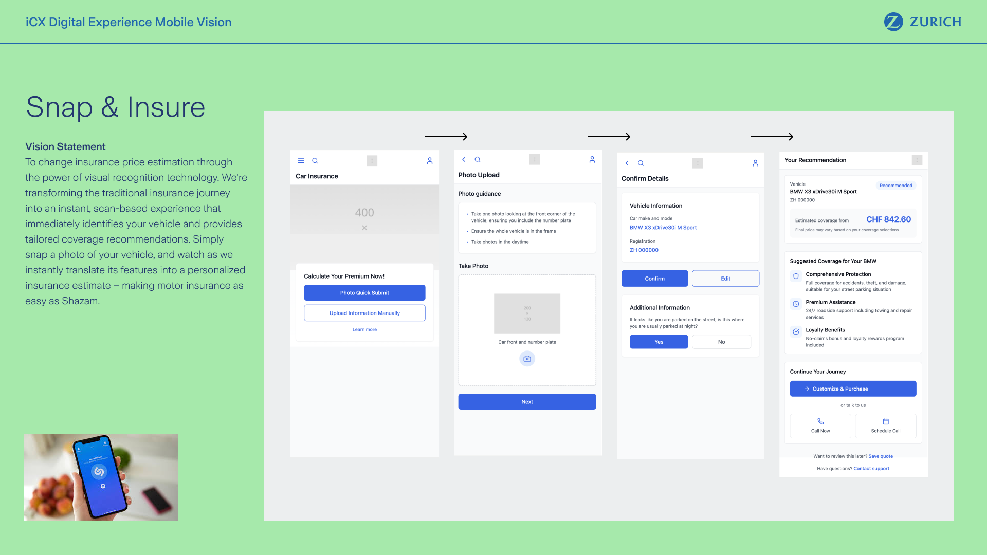
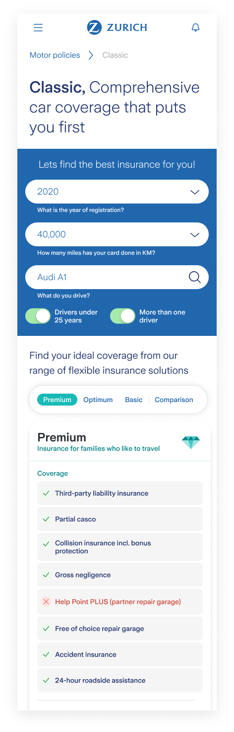
Streamlined & Tailored Discovery: Replaced fragmented, one-size-fits-all pages with a unified journey that pivots to show bespoke value for each product, making it significantly easier for users to navigate and discover relevant coverage.
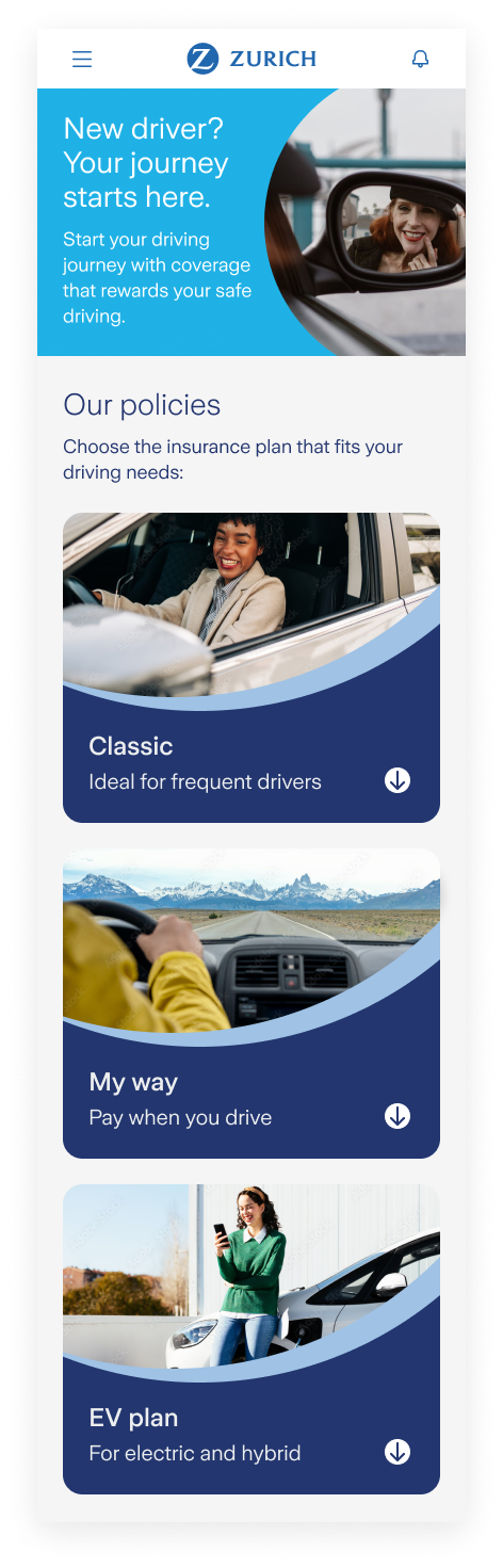
Visionary Homepage Design: Reimagined homepage design to instantly champion Zurich’s status as a market leader. By leading with reliability data and "trust signals," the design establishes immediate credibility while making navigation effortless.
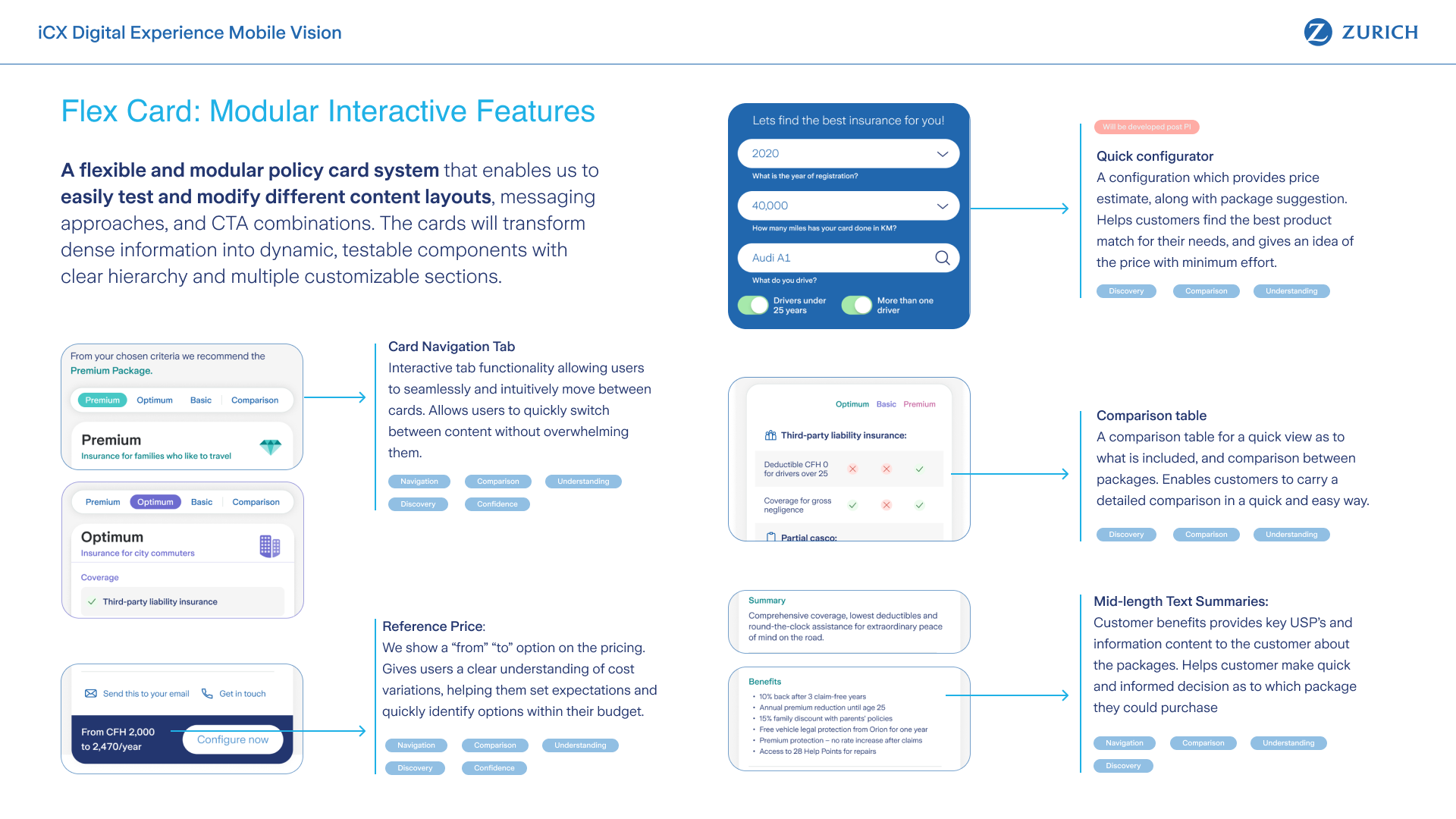
Modular "Flex Card" Architecture: Consolidated separate insurance pages into a single, interactive view using "Flex Cards" and Dynamic Comparison Tables, allowing users to toggle features and see real-time price impacts without losing their place in the journey.
Wireframe & User Journey Design Development
Flex Card, Key Component Features
Final Implementation: Use Case with Homepage & Product Pages User Journey
Visionary Concepts & AI Integration
To elevate Zurich from a traditional insurer to a technology-forward partner, we utilized Claude AI to brainstorm high-level concepts grounded in our earlier user journey discovery. Focusing on autonomy, speed, and reduced friction,we developed a suite of visionary tools that directly informed the final homepage and end-to-end journey designs.
Click on images to enlarge
2nd Design Workstream: The Visionary Homepage & End-to-End Journey
The second workstream focused on connecting our strategic AI concepts and product page logic into a single, seamless experience. By bridging the gap between the Homepage and the Quote & Buy flow, we created a cohesive journey that is rich in detail and much esaier to navigate.
Final Design: Key Features
Integrated Flex Card Ecosystem: Embedded modular vehicle and insurance-tier components into the core journey for seamless, one-page policy comparisons.
"Snap & Insure" Recognition: Converted AI vehicle scanning into a primary CTA, replacing manual forms with a "Shazam-like" photo-to-quote entry point.
"Insurance 101" Learning: Developed bite-sized, adaptive storytelling components that explain complex terms in real-time to prevent information overload.
Personalization via AI Chat: Integrated a conversational interface providing tailored advice based on real-world scenarios to build trust through dialogue.
Homepage
Product Page
Insurance 101
Quick Insights
Final Takeaway & Success Metrics
This project redefined Zurich’s mobile presence by shifting from a transactional, uninspiring, and content-heavy site to a value-first discovery engine. The result is a visually rich, future-proof framework that balances user autonomy with business performance.